How to Create Artwork For

Technical Tidbits And Semi Secret Squirrels
Things you ask yourself before we start:
- Do you wish to make really cool looking, pre-rendered 3D graphics for CL?
- Does hard work give you a case of the jibblies?
- A GMs priorities should be your priorities, as of yesterday.
- Do you want it all now, and foam at the mouth if you don't get your way?
If you answered to any yes to any of these, this page just might not be for you. If you answered yes to the last one, please visit a doctor.
Just who is this tutorial really for?
- Anyone who likes to paint.
- Do you want to learn something new, and worthwhile?
- In your mind, there's this sinister creature or place that lurks, and it wants out.
- In your mind, there's a glorious dream, and you wish to share it.
Mostly, this is for people who want to create artwork for its own sake, enjoy drawing, painting, and/or animation. People who can follow a specific style will also find this page as an invaluable resource and style guide. For those who are simply curious, this should sate said curiosity, and hopefully save many cats from burnt noses, and wasted lives.
Cutting To The Chase: An Introduction
What I will be placing at the reader’s feet, for this first of several articles, are the basic technical requirements anyone needs to know before they zoom out, and start drafting out huge batches of incompatible art resources. This, I hope to saves both you and any Game-Masters (GMs/Big Cheeses) a lot of time and headache. The written style is intended to both an educational process, and at the same time, enjoyable.
While a good bulk of the text is basically technical, it is more than a block of rules and draftsman’s guide lines. A lot of thought is given to creativity; we are all art students here; and suggestions are made on when to break the rules. Creativity is encouraged, if not fed the mutagenic-cheese of enlightenment. The information is presented in a way so as to keep you from getting a too-much-info overload. Now hopefully by the end of this tutorial, those readers who are new to drawing software will be able to render a simple white daisy, and make it move, and then themselves being able to drink cheap liquor of success.
Stealing Ilmarinen’s Hammer and Using It to Forge Pie!
This section is about certain resources you will need, and might want.
Terms to Know
Photoshop, GIMP, Graphic Converter, Graphics Tablet, Color PaletteImage-editing software:
You can use pretty much any program that can edit in, and save as GIF or PICT. Having something that has palette (lets you save mixes of RGB color) is also helpful. Thankfully most programs do, and the good ones already have the colors you need. MacOS 256 is the really the only palette you’ll be using. Try to avoid using anything else, or bad things will happen. If you’re worried about not having fancy-shmancy Photoshop, remember that it’s not needed, nice, but not really critical. I first started out with Claris Works, and Delta Tao’s Mac Cheese, and they worked out just fine.
For people who have the ability to borrow or buy it, experience tells me that Photoshop is the best, hands down. While there are many versions up to and including CS4, an old copy of Photoshop LE is probably the cheapest you can get. You can also use Adobe Image Ready, though it lacks many of the features present in LE, or regular Photoshop. Most photo-choppers will claim Image Ready is cruder in terms of features and capability, and they’re right, Photoshop’s little brother does have a nifty animation tool.
GIMP is for people who cheap out and want something like Photoshop, but free, and less user friendly. It also lacks allot of the features found in Photoshop. It’s still free, and people swear by it, and love it… till they buy an old copy of Photoshop on E-bay
If you have a graphics tablet, like a Wacom, it's very helpful, but in no way is it going to do everything for you. It IS very useful for larger objects, though, and for color. I use one now, but I also used a mouse for ages. A mouse is also preferable at times, and especially if you're going to detail things with individual pixels, or simply really using one.
"The Goggles: They Do Nothing!"
In this section, we'll talk about some of the basic technical tidbits, hoodillies, and wotnots, you need to know about artwork specific to Clan Lord.
Terms to Know:
.pct,
.gif,
Mac OS, layers in
Photoshop/
GIMP,
alpha channel,
dithering
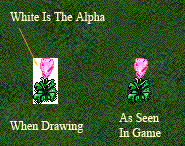
White is the alpha channel, or the transparent parts of an image. It is ignored by the client (what you use to play CL), and not shown at all. If you drew a solid white ghost, expect to see a black outline and maybe some grey bits where you tried to add shadow.
Clan Lord’s colors are, again, in Mac OS’s 256 color palette, and it’s available preloaded into Adobe products, or GIMP. Again, this means that you use should only try to use colors from the palette. If you draw in thousands-of-colors, blending and swishing color together, you can expect your image to look a bit muddy, and will need allot more hard and touchup by the time it's finished. If you try to stick to 256, your dithering can be kept to a minimum. You can be pleasantly surprised with what you can get, with so seemingly few colors. Some of the best CL-artist I've known work purely in 256, and almost always did a pretty good job.
Save your files as .psd (Photoshop Document), if possible, and only you're working in layers. If you don't work in layers, use Mac's PICT format, or CompuServe GIF (GIF), or whatever Mac Cheese uses.
Layers in most programs, are like drawing on clear pieces of plastic, and laying them one on top of another. They’re VERY useful for preserving part of your drawing, while working on something else. Some people like to outline and plan things on one layer, and do all their drawing on another layer. Overall, it’s very useful.
If you don’t have layers in the program you’re using, there’s always undo. I used to save different versions of the same drawing, and copy and paste between different documents to get what I needed.
Putting On The Pink Bunny Slippers… Of Doom
Now we get to discuss some of the great techniques and wily pitfalls found in old-man-256.
Terms to Know:
Neutral Color, Grids and Rulers, Anti-Aliasing/FeatheringNeutral Colors are often very desaturated (grey toned), and are usually good for a background, helping to define the tone and feeling you want to convey. If you were to draw a bright red rose, solid grey, or light grey-green would be good neutral colors. They're especially helpful if you don't want to draw on a solid white, or black background. If you don't use layers they're especially helpful. After you were done drawing a vase, for example, you would fill in the neutral color with white for the sake of transparency, as needed. The fill tool (often shaped like a bucket) with anti-aliasing turned off is very helpful. Neutral colors also help you with managing color, and help to define light and shadow, and are also good for defining as piece's mood.
Learn how to make up a grid, or set up a grid tool. In Photoshop, there's an option for "snap to grid." Try to remember to turn snapping off or you’ll find yourself tracing the grids’ up and down edges, rather than drawing what you want. If you feel the need to draw out a grid, try to make sure it's on a lower layer, and not being messed with If you don’t have layers, make sure the grid you draw is of a neutral color grid, so you don't get confused. A checker pattern could work, too, if you find that easier to use. Grids are especially helpful, when you want to animate something. Further down, we’ll talk about animation.
For beginners, try to use tools that use what is called anti-aliasing, or feathering. That being, try using tools that don’t blend at the edges, like a spray-can, or look semi-transparent in any way. You want to be drawing in solid, colors. Make sure your tools are set at 100% transparency. If you were to draw with the pencil-tool (preferred) and had it’s size set to 1, you would see a pixilated, somewhat jaggy line. For right now, most of you should stick to the pencil tool.
The eraser tool should also be either a block-type, or pencil type. Again, for now, use nothing that feathers/blends. It'll save you allot of headache.
If you use layers, set your layer’s blend-mode to dissolve. It turns off any feathering, and can eliminate any scuzzy grey edges on your drawing, where it should be white, and therefore transparent. This is a good reason why it’s wise to draw thing out first with the pencil-tool first. It provides your sharp edge, and you can fill it in later.

Learn to use the fill tool. Play with it. Make sure you have anti-aliasing/feathering turned off. There’s also an option called contiguous. As an example, you use your pencil tool to draw a closed circle or square on a white background. If you use the fill-tool to fill the shape with blue, and contiguous is turned on, the shape will fill with blue. If contiguous is turned off, anything white will turn blue. This is a great method for removing your neutral background layer, if you don’t use layers.
You Can Handle The Truth!: The Law, and When To Break it.
Terms to Know:
icon, avatar, sprite, delineation, pixels
Have you ever noticed how almost every character/monster/building has a black line delineating its shape? Even things that don't have a black outline, most things usually have a dark color around their edge. This gives things focus, and makes everything sharp. It's also an integral part of CL's style. Of course, there are some things that don't have a black outline, but they're usually background objects, or were not really meant stand out too much. Things that MUST have a black line are player-icons, most creatures, most buildings, and a good portion of the landscape rendered the same size as a player's sprite (icon, avatar, etc). Torches, cauldrons, and some fences are good examples. Usable objects, with few existing exceptions, should try to use black line.
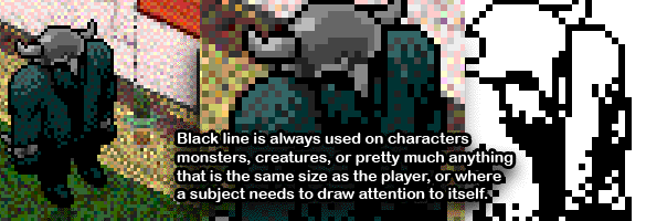
Again, black line gives things focus. It's not there just to annoy you, or just because Joe-Says-So. Rocks, trees, and anything bigger than a player, in one form or another, use black-line; some more than others. Try comparing the Wedding Chapel, to the Purple Tor, to the Courthouse. These are three separate examples of black line in large objects, and completely different use.
Now if you're making a patch of flowers/plant life, or maybe a wavy energy effect, it may not be a good idea to use solid-black as your line. Savanna grass doesn't use black-line at all, and it looks quite nice. Many flowers and patches of grass don't use black line at all. Sand certainly doesn't, nor does water. Most all of those are below people's feet, and aren't meant to stand out as much. Some good examples of when to drop the solid black line would be if you were to create a cluster of flowers for a bed, or a small trickle of water draining out of a gutter. A dark-deep color would work as well for a shape's edge, rather than solid black, and works on many levels. Say you made a rug. Yes, you could use solid black for the edges, but you'd be better off using deep-dark color. It wouldn't seem to pop as much as the things on top of it, and it would still look nice.
Trees and objects are not supposed to hide a player. In the past, this meant making your big green leafy tree semitransparent, and in the end, painful to look at. Nowadays, the transparency changes when someone goes behind your tree. Not bad, but un-necessary. Try to provide see-through spaces in your artwork, so nobody can hide in the foliage. It's one of the rules.
Keep in mind that images in CL are composed in different layers. The player is on a specific layer, and things like the ground, on a layer down below. Things like trees, or some pieces of furniture, or objects, are all on the same layer as the player's icon. This makes it possible for someone can go behind an object and/or in front of it. When a player passes halfway up something's image, they'll go behind the same-layer-object. If they go below an images halfway point, they'll be in front of it. Trees are an excellent example of this. Try to keep this in mind when you're making stuff. A halfway mark on a 90x90 pixel house would be 45 pixels up from the bottom, or 45 pixels below the image’s top. Go out, and play with some trees/buildings to see what I mean.
Dance Monkey Boy!
Here we will go over the simple techniques used to animate anything in Clanlord.
Terms to Know:

CL goes at a general art-rule, four frames per second. Sometimes the FPS indicator will say 5 frames, or one frame every 0.2 seconds. That is only dependant on the individual players bandwidth, and time of day. Try to plan on 4 frames per second.
Simple animation in CL is handled by a sequential series squares, up and down on a rectangular document, like movie film, or in an up and down column. Say you were going to make a very simple animated flower. Let's say you thought of something knee-high to an exile, and waving in the wind. You'd probably be thinking of a final piece that's 10 pixels tall. For something that's REALLY simple, you could make a jerky ten-by-twenty framed document; two frames; but you decide on ten-by-forty for a total of 4 frames, and a more dynamic image.

So you create your 10x40 pixel document, and divide it up into four parts, top to bottom. Grids are invaluable here, so parts from one frame does not run into the other, and cause strange floating speckles to show up at the edges, as the flower animates. A 10x10 pixel section frame make up the first top frame, and then the other three frames farther down the document are, you guessed it, ten pixels each. You decide It'll be a simple red flower, waving in the wind. Make your first frame, you draw the slightly bent flower standing upright, and in the second frame, it seems to bend over, and then on frame three, the stem begins to recoil back, then on frame four it’s sprang back. The animation would cycle back to frame one to start the whole thing over again. The result is a flower that waves in the wind.

Now if you wanted to, you could set up copies of the flower onto a larger document, and have the animation staggered along the frames (all frames are perfect squares, no matter what) so that you have a wave effect as the whole thing animates in a ripple effect.

Should you need to think of it in terms of numbers: say you have a 3 frame tree that waves ever so gently. If you set up 3 in a row, the one on the left would use frame to start with, the second in the middle, would use frame 2 to start with, and the third one on the right would start with frame three. As they animate, they ripple along in a wave. If you’ve ever watched tall grass in a medium wind, or oaks in a heavy summer wind, you will see what I mean.
Now by now you have probably realized that animated images are larger than static images. I'd be careful about investing allot of time in an 800x3200 image depicting an Orga doing The Hustle, as amusing as that'd be. You could, though, break those sections up into four parts, and have four 200x800 images puzzled together to show said Orga strutting their stuff.
This Is Just The Beginning
And here we close lesson one.
By now you should have enough information to create still images, and make them dance.
Feel free to send me a message on the Sentinel, or email me regarding questions, or corrections.
Up Next: Monsters, mutants, exiles, and effects: mobiles.
Open Your Mind: Subjects For Further Reading
- The Encyclopedia of Fantasy and Science Fiction Art Techniques
- by John Grant, and Ron Tiner
- ISBN: 1561385344
- Painting The Secret World of Nature
- by John Agnew
- ISBN: 1581804571
Search for these on Wikipedia.org
Excellent Reads